My Fare
Mobile App Redesign

Role
UX Researcher | UX/ UI Designer
Timeline
12 Weeks
Team
Me | Olivia Baychu | Khoi Nguyen | Tina Le
Tools
Figma | FigJam | Microsoft Forms + Word
Project
Overview
My Fare is a Calgary Transit app owned by the City of Calgary. This app enables transit users to purchase and save their transit fares virtually. I was tasked to redesign one page from this app that would improve the overall user experience. The homepage was chosen due to the overall information architecture, and the lack of transparency/ efficiency of use for users. This is a SAIT student project.
Client Goal
Disclaimer*
The live site is still the previous version. The client intends to relaunch the redesigned version once new product photos are completed.
The client wanted to increase product sales by optimizing the website to bridge the gap during slow periods when not actively selling at the local markets. They also wanted a more specific brand identity that would help tailor the website towards their target audience.
The
Problem
How might we streamline the homepage navigation to have fewer interactions to access key features?
My
Goal
Simplify navigation and prioritize ticket-handling so users will experience the app with minimal cognitive load.
Redesign the trip planning features to be easily accessible, intuitive, and error-free when completing actions that cause redirection.
Design
Process
Design thinking was the framework chosen for this app redesign. As this was a SAIT project, there were specific research processes that were required to be completed during this framework. The design thinking processed allowed me to be iterative with my research at each phase. I often went back and forth between phases to compare findings and find the root cause of the problem.

Process Overview
Empathize
-
Competitive Analysis
-
Quantitative Data: (Surveys)
-
Qualitative Data: (User Interviews and Usability Testing)
-
Heuristic Analysis
Define
-
Affinity Map
-
Information Architecture
-
Customer Journey Map
Ideate
-
Card Sorting
-
User Story Map
-
Lo-fidelity Wireframes
Prototype
-
Med-fidelity/Hi-fidelity Wireframes
Test
-
Feedback
I originally thought the My Fare app needed to be completely redesigned with a bunch of new features based on information found in the Empathize phase. I realized this would not be feasible from a business standpoint. I needed to think holistically to find the root cause of the problem. This is discovered in the Define phase.
Starting out, I completed a competitive analysis to find common transit app practices, and to discover features that made My Fare differ from the rest. We created a survey and conducted user interviews and usability tests to provide perspective from different viewpoints. This aimed to assist in pinpointing common issues and potential improvements. Additionally we conducted a heuristic analysis to monitor best UX practices.
Competitive Analysis
I conducted a competitive analysis where I looked at five other transit apps that commuters use in different cities in Canada. I compared key features available within each app to see how My Fare differed from the rest.

Quantitative Research
Using Microsoft Forms, I created a 15-question survey in search of feedback on experiences with the My Fare app. I wanted to make sure we gathered research from as many Calgary Transit users as we could. Information I was pursuing include current features users enjoyed or desired, feedback about the current interface, and if/why they faced any challenges.
With 37 responses, I was able to identify the most wanted features of the app.
01
Purchased Passes
02
Schedules
03
Ticket Purchases
Frequent frustrations were also identified. These include:
-
Redirection out of the app without being notified.
-
Too many options when selecting fare information.
-
Lack of available bus times.
-
App constantly crashing.
72% of survey participants faced challenges while using the app.
I also conducted 5 user interviews where I asked questions more specifically about branding. I asked what colours the words "men, outdoors, rugged, and grit" made them think of. This gave me insight into what colours users would expect to see when entering the website.
40% mentioned beige/tan.
80% mentioned green.
100% mentioned brown.
Qualitative Research
We conducted four user interviews and two usability tests. The interviews allowed us to listen and understand where specific frustrations were coming from. An app that was brought up a lot was the green Transit app. This app has many of the features these users were wishing for on My Fare. The ideal target audience for our research is shown in the persona below.

75% of interviewees said they expected trip planning information would be available.
100% of testers found the app difficult to navigate through.
Heuristic Evaluation
Using the Nielsen and Molich’s Heuristics guide, we determined four heuristics that required action.
-
Recognize, Diagnose and Recover from Errors.
-
User control and Freedom.
-
Visibility of System Status.
-
Consistency and standards.
When users navigate the app, many of the buttons clicked will redirect them out of the app to the My Fare homepage, without any warning or way to cancel out of the action.
Select plan your trip

Directs you to Transit app or App Store

Select schedules, service updates, website, etc.

Directs you to the Calgary Transit website homepage.

There is also a lack of clear and consistent navigation throughout the app.
Select the hamburger menu to find more information.


Brings users to the account settings page.
Empathize
Define
With the data gathered from our surveys, interviews, and usability tests , we put together an affinity map to see where the main pain points lie based on our research from the empathize phase. I then created the information architecture of the current homepage to visualize how the features are structured and identify potential areas for improvement. Creating a user-centered customer journey map revealed key pain points within My Fare.
Information Architecture
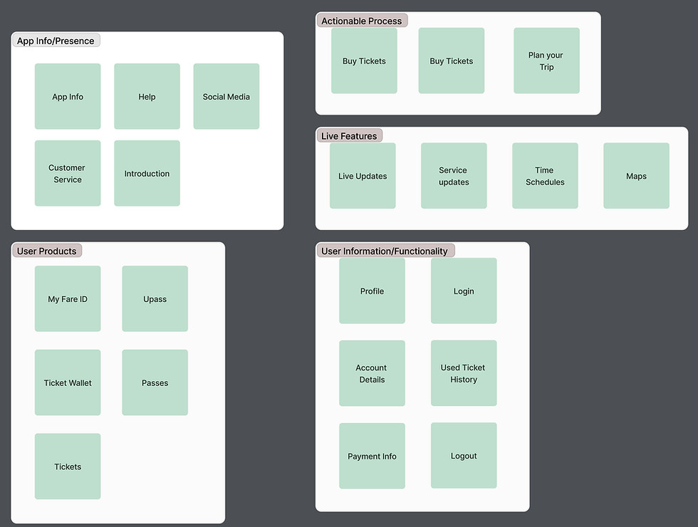
Using FigJam, I mapped out the current information architecture to see how many interactions were on the homepage. This highlighted that the desired categories of information are hiding within the hamburger menu.
.png)
I realized that users were frustrated with My Fare because although the app was created for the purpose of purchasing and storing transit tickets, the information architecture of the app suggested it could be used for trip planning as well. By having these extra features scattered within the app, users were being navigated on false expectations. A significant pain point was users were not being informed that by selecting any other feature other than ticket handling, redirection would happen to either a webpage or another mobile app. Additionally, the webpage would not take them to the proper page to complete the action they were seeking.
The root cause of our problem was the apps core feature, ticket handling, was not being presented as the main focus of the app.
*Due to the project focus being on only one page, additional improvements to other found pain points, like ticket purchase process, was not focused on.
Ideate
This new found discovery drove our ideation sessions with a direct purpose. Now that we knew our goal was to focus on the redirection issues and the Information Architecture of the homepage and available features, we tailored our research with this in mind. We conducted card sorting sessions to categorize information, created a user story map to analyze what our MVP would be, and created lo-fi wireframes to visualize our new design.
Card Sorting
Using FigJam, five open card sorting activities were conducted with cards containing current categories, wanted features, and blank cards for our testers to fill in. I wanted to know what categories our users would put these features in without any additional persuasion. Tickets, Trip Planning, and Account Information were found to be key categories.


Lo-fi Wireframes
I wanted to redesign the homepage so the main purpose of the app, ticket purchasing and handling, was at the forefront of the homepage. By removing the “ticket wallet” button and adding a carousel of purchased tickets instead, it allows users to quickly and efficiently access their tickets when they are on the go. Creating a navigation bar will align with consistency with other apps and quicker recognition for users.

Prototype
My team analyzed the City of Calgary brand guidelines to create our design systems. Using Figma, we created med-fidelity wireframes for the homepage. Before creating the hi-fi wireframes, I helped create components and designs using the design system to guarantee consistency and unity within the brand.
Med-fi Wireframes
I decided to create an additional med-fi wireframe for the trip planning page to show how there redirection would be communicated with users.

Removal of ticket wallet. Added carousel of purchase tickets for quick access.
Navigation bar with simplified selections to remove confusion.
The button shape for buying tickets was changed under the assumption that we would have another selection added. Later on, I determined that the button design was inconsistent with the other buttons within the app. It was reverted to the original layout in the final design.

Transparent information that users will be sent to the Calgary Transit website.
All redirected links on one page.
The underlined links would have been effective for a website design, but with multiple links in a row on a mobile app, it would've been difficult for a user to interact without potentially tapping another link by accident, causing an error. This is changed in the final design.
Solution


Simplified Homepage
Visibility of system status
-
Creates a clear narrative that this app is meant for transit ticket fares.
-
Allows a clean layout with a clear hierarchy.
-
Purchased tickets are easily accessible for quick, on-the-go interactions.

Trip Planning External Links
User control and freedom +
Recognize, diagnose, and recover from errors
-
Allows users to know they are being redirected out of the app before they make a selection.
-
Direct connection to the Calgary Transit website, in the specific categories selected, enabling the users’ task to still be completed within the Calgary Transit network.

Navigation Bar
Consistency and standards
-
Improves the user experience with an easier user journey.
-
Removes confusion on where to find specific information.
-
Aligns with competitor layouts for easy understanding.
Test
Due to the project being a SAIT student project, proper user testing wasn't a requirement for the completion of this project.
Feedback
Feedback was received from our instructor and peers. I combined the top 3 success comments we received when we presented our redesign to those who use My Fare currently.
01
Effective simplicity of the new layout
02
Navigation bar with minimal categories
03
Clear communication of redirection
Future Improvements
The trip planning tab is currently the minimum viable product (MVP). Ideally, this section would have these features actively integrated and working within the app to compete with its competitors.
Reflection
This was one of my favourite projects that I’ve worked on. Although I was off track in the beginning, my research and analysis enabled me to find the root cause in the end. I learned so much about user research, design systems, and how to work in a team.
Challenges
Not conducting final user testing.
Due to time constraints and assignment requirements, testing had not been completed. I am lacking the validation from feedback on the redesign to know if this design would be successful in the real world. I would like to complete testing so I can understand and fix any pain points or add improvements to the final design.
Understanding business limitations.
In reality, businesses aren’t always going to have the budget to rebuild an app with extra wanted features, especially if it's not their main goal. Understanding the root cause of the problem and how to fix it with resources already available was crucial.
Key Takeaways
Understand what the business’s vision and goals are before starting my research.
This will allow me to dive deeper into more valuable research that will positively impact both the user and the business.
How to work together in a team with other UX designers.
Learning how to work together and combine unique ideas to achieve our goals was a valuable lesson. Trying out different research methods together for the first time, as we were all students learning, was hard but so rewarding when completed with usable results.
How to conduct different UX research and design methods.
Conducting card sorting sessions, synthesizing data into an affinity map, creating a customer journey map + user story map, and using brand guidelines to make a design system were all new methods I learned throughout this project.